 Rear of CD - Our EP consists of 3 tracks
 Inner image
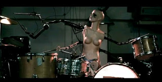
 Still from Electric 6's - high voltage
  Establishing shot from our production
From our research on similar bands from our genre we have seen that the generic video will follow a narative, we challenged this convention by making a video that doesn't, instead we chose to create a series of seemingly random shots that fit with the pace of the music. Our montage style music video consists of various shots of the band taking part in obscure activities and actions in different locations that we have thrown together. Below is the location that we carry mainly throughout the whole video, we got inspiration for this, again from 'Balloons'; where they have a similar style setup. With use of antique 50's furniture and props we have supported our vintage mise en scene well and used the sofa as a focal point within our video.
 The shot below shows the focal location that we continued throughout the video. It was also a still we took from a sequence of shots in the video, where each band member skips along the sofa showing a deliberately poor continuity effect. This particualr effect we used a few times in our production as we believe it creates an abstract feeling and adds to the quirky mise en scene we created.
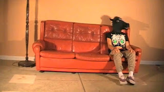 Sofa still from our production
 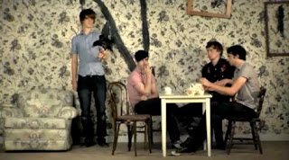 Still from Balloons - Foals
We were aware that one of the key features from the foals video was the focal wallpaper which pretty much made the mise en scene for them. As our resources and locations were limited we had to do without such extras, though we did feel our locations and props still represented our chosen mise en scene quite obviously; plus we enjoyed the element of simplicity that we had. The old school red sofa and the stand up lamp became a common theme in the video and a shot we reverted back to alot to create unity.
We included vast amounts of drumming footage in our video as we wanted the drumkit to also become a focal point throughout the production. We also wanted to focus a lot of the video on the drumming because of the experiemental drum beats throughout, we believe that they created the fast paced, unique sounds that we were looking for and we just generally love the magic that will provides. Regarding shooting the drums, we varied our angles immensely to rule out any tedium.


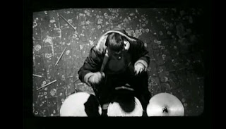
The ariel angle that we shot was mainly to show that we could go one further when it comes to providing a variety of shots. The idea of cutting out wills head and just having the kit and sticks in show, represents him as a kind of robotronic drum machine with no identity - constantly keeping the beat flowing for the duration of the song. This is a recreation of a scene in the Miike Snow music video for 'black and Blue' - (Screen shot 2nd down*).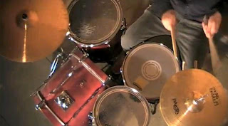 Ariel still from our production
*Still from Miike snow's black and blue
 Original influence for the ariel drummer angle - Arctic Monkeys, View from the afternoon
 This angle that we have used also challenges the norm as in most band music videos, the drums are shot from front or side on, and eye level.
The first convention that we have taken from another media product and adapted is the focal image feature. We discovered many products that influenced our ideas for our album cover but the main designs happened to be ones which possessed a figure/face as their main focal image. We very much liked the designs with this style of image as the focus was all on the character or figure in the centre. Examples of albums which influenced this design feature are: Head Automatica - Propaganda, Foals - Antidote. As you can see below, the Head Automatica album is very simple anyway with no background which supports the focus on the forefront image. To adapt our original image to do this we've darkened the photo; because the original image has such perfect lighting we were able to do a lot with our album cover.


We decided to not follow the norm when it came to the album cover and feature a group shot of the band or the lead singer, instead we decided to use an artier style picture of Josh, the bassist. In doing this we stay loyal to the point that we trying to create album "artwork" and not just a simple image of the band. We think that in recent years the finesse of album artowork has been lost and in doing our fisheye shot of Josh, with the cutout filter on top we tryed to revive it. We also decided not to use a huge font for the band name as it was our intention to intise the audience with the quirky artwork, making this a trademark for the band. In conclusion, we wanted to make it a piece of art as much as advertisement for the band.


How effective is the link between your main task and ancillary tasks?
We believe that we have linked our three products together succesfully and created a marketing campaign, rather than three individual products. The theme we wanted to keep constant through out the campaign was that of our vintage mise en scene and feeling.
We have linked the album cover, poster and video together by using the same people through out, the poster being an image of Jack in the horseman mask and the album cover being an image of Josh. We think that the horseman is a key element in creating a brand for the band, it is a unique selling point. The horseman is different and quirky, which is another aspect we wanted to keep constant, it also symbolises the teenage rebellion element that we wished to portray. It is a brand label for the band that can be instantly recognised and linked with Junior Fencing Club, by using the horseman heavily in the video, the audience will easily link the poster to the band as the main image is the horseman. The background of the poster is a festival setting, which offers connetations of drinking, music and violence, we linked this with the fast paced music, especially at the end of song, when the band are fighting and the lights are flashing.
We have tried to illustrate the rebellious attitiude of the band across the three products, the image on the album cover has alot of attitude and we believe is portrays this exact feeling. The colur scheme used in the ancillary tasks is that of earthy colours that we think supports the vintage theme by using deep colours that have connetations of antiques etc.
We purposely used the same fonts on both the poster and album cover to create unity between both, it also allows the audience to recognise the link. The same photoshop filter was used on both image, to again create a link between them. By using the same effect, the mask cutout, we again are creating trademarks of the band that then become synonymous with our marketing, bands that have sucesfully done this are, for example Vampire Weekend. Both, their albums and posters use the same bold white font and saturated vintage images that have now become trade marks and are recognisable as features of Vampire Weekend's marketing. We have tryed to do this in a similar way by using the fisheye lense for both images and keep the font used constant. In our opinions we have sucessfully done this.

 We have tryed to do this in a similar way by using the fisheye lense for both images and keep the font used constant. By using the same font and the same effect on the image we have made the products look similar and by doing this linked them together. Another feature that we believe we have made into a trademark of the band is the reduced colour palet on the images, they look almost like cartoons, a feature we could reproduce within other marketing campaigns.


 The general opinion of this design was that the colours weren't as appealing as they could be and that the repeat of the same image gets abit tedious. They also said that the title isn't as striking as we have made it in previous designs.
 The main opinions of this design are that the title is effect and eye catching though it does cover the majority of the image, and that the image was the most effective part of the design and has lost this as we've covered it.
 Many people enjoyed this, they liked the colour scheme throughout the design and thought that the pixelated filter gave a good vibe. However as our feelings are so strongly against this we will not be using it. The main reasons for this are that the style of album cover reflects a dance/electro band and that the effectiveness of the striking image is lost due to the filter.

