
Showing posts with label jack. Show all posts
Showing posts with label jack. Show all posts
Monday, 25 January 2010
Wednesday, 6 January 2010
evaluatión -
In what ways does your media product use, develop, or challenge forms and conventions of real media productions?
Within our reaserch and planning stage we looked at a range of media productions, taking inspiration from each. We looked at many videos, taking the aspects we liked from each and deciding on the conventions we were planning on devoloping or challenging. Our main inspiration came from the "Foals" video of "Balloons".
Below is an exmple of a shot we enjoyed and recreated in our video, which is from Electric Six's, High Voltage video.
 The shot below shows the focal location that we continued throughout the video. It was also a still we took from a sequence of shots in the video, where each band member skips along the sofa showing a deliberately poor continuity effect. This particualr effect we used a few times in our production as we believe it creates an abstract feeling and adds to the quirky mise en scene we created.
 Original influence for the ariel drummer angle - Arctic Monkeys, View from the afternoon

We used the lead singer in two ways in the video, playing himself, miming in some parts and generally interacting in others, and also as horseman. By using the horse mask we brought a random edge to the video that we think makes it interesting and humerous. Its random as there is no need for it, but it, in our opinion is cool feature of the video, it also meets our non-conformist criteria. We tryed to make the horseman almost a brand label for the band as he features heavily in the video and also on our poster.

We felt we had to use some shots of Sutho miming the song as it is a generic convention of a music video, however we kept it to a minimum as we felt it slows down the pace of the video and can be boring. For these reasons we had only two shots of miming, a mid shot and a close up.


 We have tryed to do this in a similar way by using the fisheye lense for both images and keep the font used constant. By using the same font and the same effect on the image we have made the products look similar and by doing this linked them together. Another feature that we believe we have made into a trademark of the band is the reduced colour palet on the images, they look almost like cartoons, a feature we could reproduce within other marketing campaigns.


With greater resources we may have considered trying to intergrate the "cartoon" effect within the video, due to the technical restraints we could'nt do this. Despite not being able to do this we think we linked the video to the ancillary tasks well, knowing what the image that we were trying to create helped us focus on devoloping three products that link closely. This image being the quirky, non conformist edge that we believe we achieved; through the use of such things as fish eye lenses; horseman adding a random side to the campaign; the different effect we used on the images and the montage style video.
What have you learned from your audience feedback?
We took are audience feedback ver seriously during the planning and devolopment of all three of our tasks, not only did we take into account the views of our teachers, but the views of our peers, both media and non-media students. The feedback helped us, as we gained insight into how other social groups felt about our products and gave a perspective we didnt have, this is due to obviously as two males, we cant view our product from a female point of view or how we cant see it from the eyes of someone with different interests. Even though we didnt always ask the opinions of people from our stereotypical target audience, we knew the imporatance of still appealing to a large demgraphic and took their views into consideration.


Within our reaserch and planning stage we looked at a range of media productions, taking inspiration from each. We looked at many videos, taking the aspects we liked from each and deciding on the conventions we were planning on devoloping or challenging. Our main inspiration came from the "Foals" video of "Balloons".
Below is an exmple of a shot we enjoyed and recreated in our video, which is from Electric Six's, High Voltage video.
 Still from Electric 6's - high voltage
 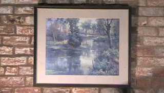 Establishing shot from our production
The above shot is taken from the opening scene of our production. We've tried to establish the mise en scene in this scene. The vintage style painting helped to create the mood that flows throughout the video and allow the audience to understand the mise en scen we were trying to portray. We believe we have attempted to create a quirky mise en scene, that challenges the conventions of a stereotypical indie boy band music video. As we have aimed to create a unique, abstrct we have chose conventions that are rarely used to attract our target audience of non-conformists.
From our research on similar bands from our genre we have seen that the generic video will follow a narative, we challenged this convention by making a video that doesn't, instead we chose to create a series of seemingly random shots that fit with the pace of the music. Our montage style music video consists of various shots of the band taking part in obscure activities and actions in different locations that we have thrown together. Below is the location that we carry mainly throughout the whole video, we got inspiration for this, again from 'Balloons'; where they have a similar style setup. With use of antique 50's furniture and props we have supported our vintage mise en scene well and used the sofa as a focal point within our video.
The shot below shows the focal location that we continued throughout the video. It was also a still we took from a sequence of shots in the video, where each band member skips along the sofa showing a deliberately poor continuity effect. This particualr effect we used a few times in our production as we believe it creates an abstract feeling and adds to the quirky mise en scene we created.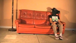 Sofa still from our production
 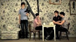 Still from Balloons - Foals
We were aware that one of the key features from the foals video was the focal wallpaper which pretty much made the mise en scene for them. As our resources and locations were limited we had to do without such extras, though we did feel our locations and props still represented our chosen mise en scene quite obviously; plus we enjoyed the element of simplicity that we had. The old school red sofa and the stand up lamp became a common theme in the video and a shot we reverted back to alot to create unity.
We included vast amounts of drumming footage in our video as we wanted the drumkit to also become a focal point throughout the production. We also wanted to focus a lot of the video on the drumming because of the experiemental drum beats throughout, we believe that they created the fast paced, unique sounds that we were looking for and we just generally love the magic that will provides. Regarding shooting the drums, we varied our angles immensely to rule out any tedium.


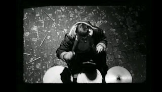
The ariel angle that we shot was mainly to show that we could go one further when it comes to providing a variety of shots. The idea of cutting out wills head and just having the kit and sticks in show, represents him as a kind of robotronic drum machine with no identity - constantly keeping the beat flowing for the duration of the song. This is a recreation of a scene in the Miike Snow music video for 'black and Blue' - (Screen shot 2nd down*).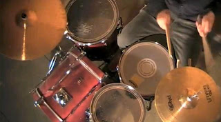 Ariel still from our production
*Still from Miike snow's black and blue
Original influence for the ariel drummer angle - Arctic Monkeys, View from the afternoon This angle that we have used also challenges the norm as in most band music videos, the drums are shot from front or side on, and eye level.
The first convention that we have taken from another media product and adapted is the focal image feature. We discovered many products that influenced our ideas for our album cover but the main designs happened to be ones which possessed a figure/face as their main focal image. We very much liked the designs with this style of image as the focus was all on the character or figure in the centre. Examples of albums which influenced this design feature are: Head Automatica - Propaganda, Foals - Antidote. As you can see below, the Head Automatica album is very simple anyway with no background which supports the focus on the forefront image. To adapt our original image to do this we've darkened the photo; because the original image has such perfect lighting we were able to do a lot with our album cover.


We decided to not follow the norm when it came to the album cover and feature a group shot of the band or the lead singer, instead we decided to use an artier style picture of Josh, the bassist. In doing this we stay loyal to the point that we trying to create album "artwork" and not just a simple image of the band. We think that in recent years the finesse of album artowork has been lost and in doing our fisheye shot of Josh, with the cutout filter on top we tryed to revive it. We also decided not to use a huge font for the band name as it was our intention to intise the audience with the quirky artwork, making this a trademark for the band. In conclusion, we wanted to make it a piece of art as much as advertisement for the band.
The shot below shows how we used some shots from what could be called the making of the video. We linked these in with the normal shots to create blog style footage that creates a relaxed feeling to the video as the audience can see the band in everyday moments and brings the band closer to the audiecne, we havent seen this much in other videos but believed it could be a good way to market the band as tangible to the audience.
We used the lead singer in two ways in the video, playing himself, miming in some parts and generally interacting in others, and also as horseman. By using the horse mask we brought a random edge to the video that we think makes it interesting and humerous. Its random as there is no need for it, but it, in our opinion is cool feature of the video, it also meets our non-conformist criteria. We tryed to make the horseman almost a brand label for the band as he features heavily in the video and also on our poster.
We felt we had to use some shots of Sutho miming the song as it is a generic convention of a music video, however we kept it to a minimum as we felt it slows down the pace of the video and can be boring. For these reasons we had only two shots of miming, a mid shot and a close up.
How effective is the link between your main task and ancillary tasks?
We believe that we have linked our three products together succesfully and created a marketing campaign, rather than three individual products. The theme we wanted to keep constant through out the campaign was that of our vintage mise en scene and feeling.
We have linked the album cover, poster and video together by using the same people through out, the poster being an image of Jack in the horseman mask and the album cover being an image of Josh. We think that the horseman is a key element in creating a brand for the band, it is a unique selling point. The horseman is different and quirky, which is another aspect we wanted to keep constant, it also symbolises the teenage rebellion element that we wished to portray. It is a brand label for the band that can be instantly recognised and linked with Junior Fencing Club, by using the horseman heavily in the video, the audience will easily link the poster to the band as the main image is the horseman. The background of the poster is a festival setting, which offers connetations of drinking, music and violence, we linked this with the fast paced music, especially at the end of song, when the band are fighting and the lights are flashing.
We have tried to illustrate the rebellious attitiude of the band across the three products, the image on the album cover has alot of attitude and we believe is portrays this exact feeling. The colur scheme used in the ancillary tasks is that of earthy colours that we think supports the vintage theme by using deep colours that have connetations of antiques etc.
We purposely used the same fonts on both the poster and album cover to create unity between both, it also allows the audience to recognise the link. The same photoshop filter was used on both image, to again create a link between them. By using the same effect, the mask cutout, we again are creating trademarks of the band that then become synonymous with our marketing, bands that have sucesfully done this are, for example Vampire Weekend. Both, their albums and posters use the same bold white font and saturated vintage images that have now become trade marks and are recognisable as features of Vampire Weekend's marketing. We have tryed to do this in a similar way by using the fisheye lense for both images and keep the font used constant. In our opinions we have sucessfully done this.
We have tryed to do this in a similar way by using the fisheye lense for both images and keep the font used constant. By using the same font and the same effect on the image we have made the products look similar and by doing this linked them together. Another feature that we believe we have made into a trademark of the band is the reduced colour palet on the images, they look almost like cartoons, a feature we could reproduce within other marketing campaigns.With greater resources we may have considered trying to intergrate the "cartoon" effect within the video, due to the technical restraints we could'nt do this. Despite not being able to do this we think we linked the video to the ancillary tasks well, knowing what the image that we were trying to create helped us focus on devoloping three products that link closely. This image being the quirky, non conformist edge that we believe we achieved; through the use of such things as fish eye lenses; horseman adding a random side to the campaign; the different effect we used on the images and the montage style video.
What have you learned from your audience feedback?
We took are audience feedback ver seriously during the planning and devolopment of all three of our tasks, not only did we take into account the views of our teachers, but the views of our peers, both media and non-media students. The feedback helped us, as we gained insight into how other social groups felt about our products and gave a perspective we didnt have, this is due to obviously as two males, we cant view our product from a female point of view or how we cant see it from the eyes of someone with different interests. Even though we didnt always ask the opinions of people from our stereotypical target audience, we knew the imporatance of still appealing to a large demgraphic and took their views into consideration.
We made drafts and re-drafts for the video and album cover as you can see from our blog, however after extensive research and exact planning we used the first version of our poster. None the less, we still got audience feedback and they agreed that it fit our mise en scene and campaign well.
We required the most feedback on the album cover as it caused the most debate, our first drafts were very simple as we wanted to keep it plain and generic, these can be seen on the blog. However, after feedback it was decided that we needed to do more work on it and embelish the image with photoshop, at this point we had made around five mock ups. Once again the audience feedback came back with some negative points, mainly about it not fitting our genre, which in perspective were fair points. Then we produced our final piece and gained audience feedback, it was only now that both we and the audience were completly happy. As you can see audience feedback was the driving force within the development of our album cover and we feel really helped to push us to produce a better product that offered something to a wider demographic. This can be seen in our audience feedback posts.
With regards to our video, audience feedback once again was useful. On the day of filming we ended up putting together the majority of our video, we posted this on youtube and our blog so that we could get some feedback. For the most part it was positive, with only a few small points to ammend, opinions from teachers and peers were helpful as they could see the mistakes that we had missed. We then put together another draft, and once again posted it on the blog, we then took more feedback and changed it accordingly. The final piece took onboard all the points that were made during feedback sessions and we think its a success.
In conclusion, audince feedback was vital to the development of all three of our products and we took it seriously as we understood the importance of gaining another perspective, other than our own. We think that our campaign is far better than it would have been thanks to understanding how the audience viewed our product.
How did you use media technologies in the construction and research, planning and evaluation stages?
We used a large variety of equipment and technologies whilst producing our music video. Throughout the research and planning stage of the project we needed computers to find and analyse existing media texts and products and also to setup our blog. The blogs this year were completed on blogspot.com or now known as blogger. We believe that in comparison to our pevious media year, this made the blogging side of the project easier, faster and more accessible.
Also in our planning stage, we took the time to create a digital image story board. We did this using a standard Canon EOS 500, using this allowed us to produce much clearer image of around 12-15 megapixels. Through the use of a usb cable we easily uploaded our images onto a PC and added them to our blog; without the use of such equipment we would of been left with a much poorer quality of images if any atall.
For our actual music video, we deviated from the original plan of borrowing the schools cameras and used a friends; as we wanted to produce a good quality, thorough product. Setting up our sets and mise en scene took a lot of thought and time and in the end we feel that one of our greater decisions was the use of the decorating lights. These were easy to setup and transformed what would have appeared amaturish into something more professional looking. Once we had shot all of what we felt necessary, we uploaded our footage on to an Apple Mac and opened up a program called iMovie. iMovie is a much simpler and faster version of the program Movie Maker - Windows. Without the use of iMove we would have had to use a different video editing program which may have affected the precision of the editing skills that we showed.
Planning, producing and editing our Album art and poster art were all done on the same program which was, Adopbe photoshop elemtents. This program is one of the most popular for editing and enhancing images and allows one to lose their self and get really creative. Without this software we would have had real trouble creating our ancillaries and would either have ended up being of a really low standard or similarly significantly boring.
Friday, 11 December 2009
decision after feedback.
Afer recieving some audience feedback from other media students and non-media students, taking note from mainly our target audience, we have decided to go with this cover (below)
The comments generally said that they enjoyed the simplicity of the piece and thought that the bolder texts took emphisis away from the image.

The comments generally said that they enjoyed the simplicity of the piece and thought that the bolder texts took emphisis away from the image.
Thursday, 10 December 2009
album cover- fifth idea.

This version is in our opinion completly different from the rest. We have used the original image of Marvin and then added a cut-out filter to it. We have then duplicated it four times and slightly changed it each time, we have taken inspiration from Blur's 'Best of' album.
album cover- fourth idea.

This version is a mixture of the first three drafts. We have used the image of Marvin as we believe its the best one out the ones we have, as it has the most impact. We have then used the translucent headings over the face and changed the opacity as it goes down the page. We enjoyed the joined up style had writing for the album name and have carried it over to this version.
We believe as this is a mixture of all our ideas it displays all aspects that we want and the representaion meets our criteria.
Tuesday, 8 December 2009
MUSIC POSTER
 And here we have our album promotion poster.
This is not only a promotional product, its a piece of art.
We have taken an image of horseman from the video and used a fisheye lense to make it look different and more creative. The fisheye lense has focused all emphasis on the centre of the image and made the image eye catching; it almost gives the image a 3D element that sticks out to the viewer. The background is that of a music festival (Reading in this case), this has obvious connetations of alcohol, sex and youth; these are all aspects that we are trying represnt through our marketing campaign.
Monday, 7 December 2009
album cover- third idea.
 The image is of the bass player Josh Marvin, we think it is a powerful image that represents Marvin in a youthful, fun way, the lighting also compliments him as it focuses all attention on the foreground, that being his face. The image itself fits the profile we are aiming for, the gesture he is using is a complete random one that represents youth rebelling against society, this fits with are video as we use many seemingly random shots in it with attitude. The image is powerful because the background is so dark and all emphasis in on marvin.
We put a film grain filter on the image in Photoshop, this makes it look old and adds the vintage edge we are looking to represent throughout our campaign. Because we wanted all emphasis in this piece to be on the image, we used a small font in the corner for the titles. By doing this we have also made the album to look more as a piece of art than as an advertisement for the band, we believe this will appeal to our non conformist target audience.
We chose the name "Knickerbocker Glory" as it is again, quite random and we enjoy the playful, youth like connetations. We also believe it has connetations of an 1950's ice cream parlour, this fits the ideolgy we are looking to create.
This was the process when making the cover.

This is the image with the grain filter on it, - that gives the vintage, weathered look we wanted.

We cut the original image down to the average CD cover size. This cut off quite abit of the fish eye border but you can still see that the image has the effect on it.

This is our original image of josh, taken with a fish eye lens. - the lighting is just perfect and focuses on his face just enough.
Second Version Video
This is our second version of the music video, we have put the opening sequence and have ammended some of the points raised after the first version. Due to difficulties getting all the cast together again we are having troubles changing bits where more filming is necessary, we will try our best to do it again.
album cover- second idea.


This is our second draft of the album cover. We have changed the image as we believe it is a more powerful image as it the lighting compliment Marvin's face and all focus is on the foreground, as opposed to the old image that we now think is too busy.
We have applied a mosaic filter to the image and put a similar bold font on top, this time however we played around with the opacity of the text.
However, after some feedback we think that the mosaic filter takes emphsis from the power of the actual image.
However, after some feedback we think that the mosaic filter takes emphsis from the power of the actual image.
First Version Video Feedback.
We've had some feedback from the first version of our video posted below, mostly positve, however some ponits have been raised about the over all look of the video.
Both Mr.Ford and Mr.Nicole have said that the shots where the band is outside to not match the ideolgy put forward in the rest of the video, we intend to ammend this by either moving them to further back in the song, where by this point the mise en scene would be clear enough to be able to use them confidently.
There is also a shot early on in the video where horseman's head is out of the shot and makes the sequence look unproffesional. We can simply replace this shot with another out of the shots we didnt use initially.
The fianl thing we need to do is put the opening sequence on the video.
Monday, 23 November 2009
album cover- first idea.

This version we have put a simple film grain filter on the image and then added a large, bold text over the top. We took inspiration from Head Automatica's Propoaganda album. After some discussion and feedback we've deicded that this does not fully meet our vintage criteria and doesnt illustrate our creative potential.
Sunday, 15 November 2009
First version feedback
The video below is our first draft of our music video, it hasnt got the first 20 seconds on it yet as we havent edited that section. We're happy with the way it came out apart from some small sections that we want to tweek. Some parts havent come out perfect, such as when horseman's head is out of shot, we need to edit this along with some other bits.
We especially like the parts where we've put in some 'video blog' style sections in black and white and intergrated them into the video.
We especially like the parts where we've put in some 'video blog' style sections in black and white and intergrated them into the video.
Monday, 26 October 2009
Filming feedback
We got all our filming done over the half term and are really happy with the way it turned out, we even managed to do almost all of our editing. We still need to some more work to the video and make some improvements. The lighting we used really helped our filming look more proffesional and gave us consistant lighting throughout the day. All in all it was a good day and we're happy with the way the majority of the shots came out.
Tuesday, 20 October 2009


Monday, 19 October 2009
Song change boyo
After doing our story board and going to the location we've decided to now us the song 'Battleships' for our video and not 'Secret water fountain'. This will benefit us in that we can now match the faster paced tempo to a more random montage style video, however this may making the editing a bit trickier.
Monday 19th October- Dabblin' with the set
We went to our filming location today and set up the props etc. ready for filming on wednesday. As you can see from our planning posts we've put together a picture story board showing the shots and sequences we want to use in the video and the way we'll shoot it. We've also set up all props and settings for the shots and have now got a definate idea of how we want the video to look.
We've also arranged lighting for the video that we are borrowing from a friend.
Planning the shoot. 'creating the artt'
 We enjoy our work, editing on the mac.
 This is the wall we are using for several shots, mainly the opening scene. The bare brick fits with our vintage/antique theme and adds to our mise en scene.
 Main setup
 We are using this vintage red leather sofa in the majority of our shots as almost a focal point to the video. We will feature a number of shots on this sofa as we think it looks cool and adds to the representation we are putting forward of old and vintage.
 We've recnsidered the aspect of the cupboards in the corner of the wall as we think they look a bit to modern for the 1950's theme we are going for, for this reason we are moving the sofa and lamp to the other wall.
 These are just a few of the angles we intend to use in the video.


 High angle- risking life and limb from a beam
 Storyboard beginning sequence:
 This is the initial shot of the video, immediatley illustrating our theme of vintage with this antique portrait. The brick also adds to the representation.
 Zoom in of the portrait.
 Transition to a mid/high angle shot of lead singer sitting next to old stereo and tapes etc.
 Puts tape in, the tape being the song that we are actually using. Once tapes in the song starts with no bass and low volume to make it feel as if the music is coming through the headphones on the stereo. We are aiming to create this effect on the macs.
 Full volume and bass then comes in once the head phones are put on and the proper song begins.
 Straight shot of lead singer, he starts to smile and nodd.
 His head goes out of shot, and then comes back up with the horseman mask on (not shown in the picture). This introduces the audience to horseman as a vital part to the video.
 Med/long
 There is then a long drumming and guitar sequence in the song where we will feature close ups of both the drums and the guitarist (shown below). These will be face paced shots, making the transitions no longer than 2 seconds apart.
Floor tom closeup
 Snare closeup
 Bass closeup
 High hat closeup
 Tom closeup
 Med drumkit shot
  80's :)
 We will show closeup shots and med's of the guitarist depending on the part of the song.

 The cut shot figure movement will match the pace of the music and create a quirky rough image.
 These three pictures on the sofa show an effect we intend to use, with the lead singer looking as if hes moving along the sofa, this will be done by pausing the camera. This will again be done in the pace of the song.
 The pingpong throw - haircut courtesy of Neil Ford
The lamp shade choosing - 80's flowered beige vs Orange/Pink


 The outside element adds a random quirky edge, also the cobbled courtyard fits with the mis en scene from inside.
 Unique outdoor teaparty - cobbles
 Unique outdoor tea party - grass
 Coffee break - 'work hard play hard'

 This ariel view shot is a possiblity for a music poster, we would include members of the band mongin' in the suds.
 Crackin' on with the work
 just manic mate
Subscribe to:
Posts (Atom)
